Confused? Me too!
Confused! Me too …… this is my latest work in progress on the easel and it’s proving tricky to sort out what’s happening! A mass of strokes and squiggly lines. I'm hoping that this ends up as a wintery landscape of trees reflected in water but at the moment it's tricky to tell which is which.

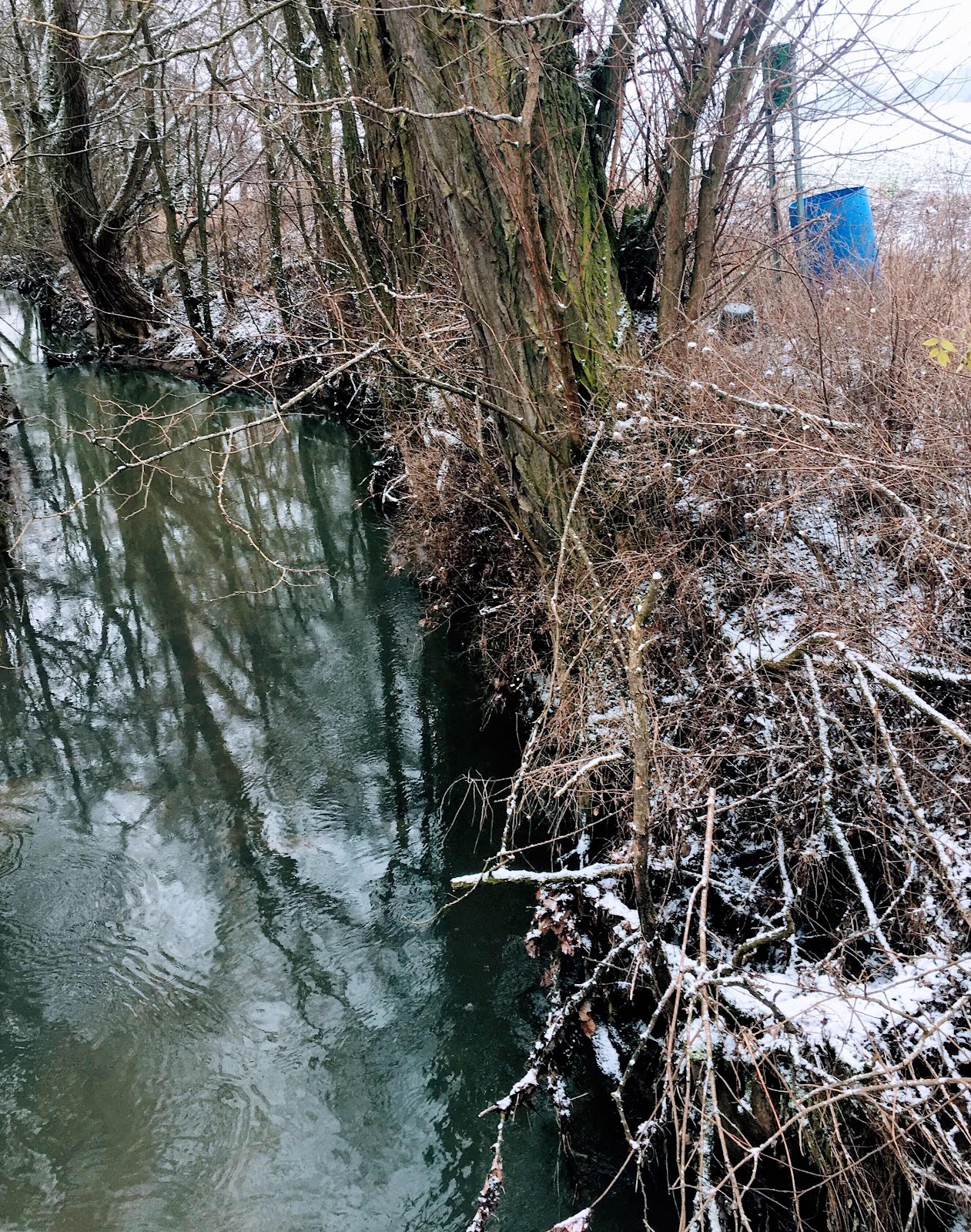
You can see here the traditional pastel technique of putting down lights and darks before setting your mid-tones. The reason for working like this is that once you thwack in your mids it is very tricky to lighten/darken areas afterwards and you tend to end up with a muddy mess. So, the contrast between light and dark areas is easily visible on this mid tone support and you also have a feel for how the composition is working, that said there is so much going on here it’s tricky to keep the overview.
Here you are, a sneak peek at my reference photo (which I don’t really like to do) and won’t that sign and the beautiful plastic barrel just create an urban contrast to my wintery landscape. That is one of the beauties of art …… no photoshop needed. Don’t like it, leave it out!
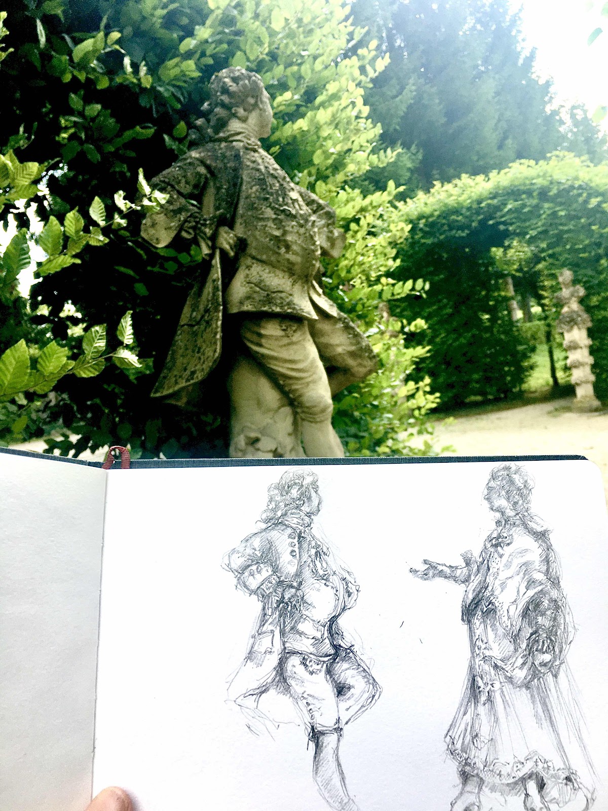
While working on a commission for a client (an old house and garden) my client was deeply distressed about which angle I should paint the house from, she really wanted view a) but that wouldn’t be possible …. so we'd have to opt for view b) which then would just show a side wall and none of the interesting details of the old house, such a pity. When I finally asked her what the problem was, she said that the house/painting would look horrible because of the honking yellow traffic sign and a huge lamp post in front of it ruining the whole scene! I had a bit of a silent giggle.
And there we are, art can solve all of those unwanted problems, I think only Oliver Cromwell wanted to be painted ''warts and all'', I'd have myself painted tall and willowy with a fabulous mane of thick hair, and this painting will be without that plastic barrel and the stupid sign.

Comments
Post a Comment