Whoops I Did it Again!
Whoops, I did it again! Forgot what day of the week it was, well what with Corona and a new lockdown on the way, I suspect it won’t be the last time either. If 2020 were a painting it would definitely be Munch's Scream! Don’t know about you, but I need something pink, with fairies and lots of frippery and here it is.

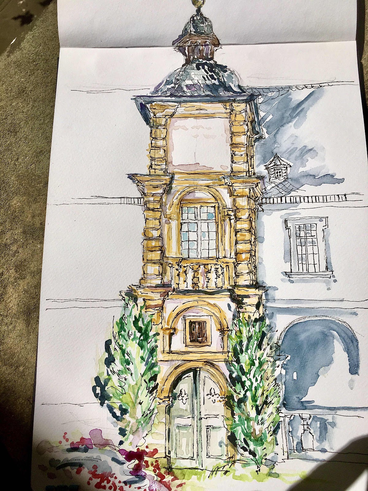
The sketch with the tower I did during the summer at Schloss Seehof but in my dotage (and probably because I'm a canny Scot) I actually have come to hate blank pages in my sketchbook so I decided to fill the upper part of the page with ceiling details from the famous White Hall.
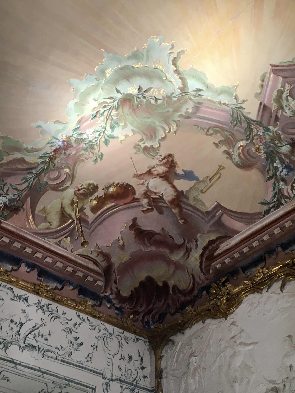
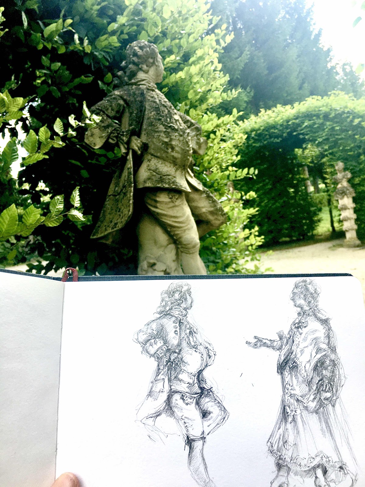
Here’s a wee peek at some plump putti! Sketching the details made me really aware of the difficulties of perspective and proportion when painting frescoes meant to be viewed from afar. The artist needs to give the observer the feeling that they could reach out and touch the figures or architectural details, light and shade have to be greatly exaggerated to create a three dimensional effect and figures of course have to be humongous! Baroque blowsiness is here perfect of course. A skinny model just wouldn’t skirt it here, you need bulging thighs, dimpled buttocks and blatantly bloated bellies (I always knew I was born in the wrong era!) but when you really look at the figures the proportions are often ''off'', the angel in my sketch had a neck that was about double the width of her head and I'm always afraid of drawing figures like that in case people think that I have problems with my proportions so I have to admit it, she is artistically photoshopped!
The putti in the fresco are exactly the same, huge legs and thighs and tiny heads, an artistic trick to build distance and depth; what is closer to you is larger, getting smaller as it is disappears off into the distance. If that central cherub was actually sitting on a piece of cornice that is how it would appear to you from below, although I'm still convinced that those ''thunder thighs'' are a teeny bit too plumptious. This ceiling certainly is a credit to the perceptional and artistic skills of its painter Giuseppe Appiani (this time written correctly) and a bit of welcome lightness and pinky girly, unicorness in an otherwise dark world.
To finish off, here is the sketch of the tower done in situ this summer ad as I hate leaving blank spaces I have to say the blank upper portion of the tower irritates me, perhaps they should have got Appiani to pop in a couple of plump cherubs or a bit of cornice to fill the ''gap''!

Comments
Post a Comment